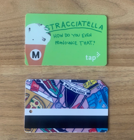
For me, fare cards represent more than just a way to pay for transit. Using MetroCard for riding the NICE bus growing up in New York, then CharlieCard when I rode the MBTA during college, stayed among the boring, everyday items needed when I walked out the door, like my keys, ID, and wallet. As I’ve gotten the chance to explore new cities and places over time, fare cards have also held space in my life as collectors’ items. I always make sure to get two keepsakes to bring home with me on trips: a postcard from an art museum and a fare card.
Thinking about how fare cards have simultaneously held utilitarian and sentimental meaning in my life, I wonder about the ways it can represent so much about the area I’m visiting. What if, like a postcard that can serve both as décor and medium for writing about travels, a fare card could serve both as transit payment and an accessible canvas?
Art on TAP in Los Angeles
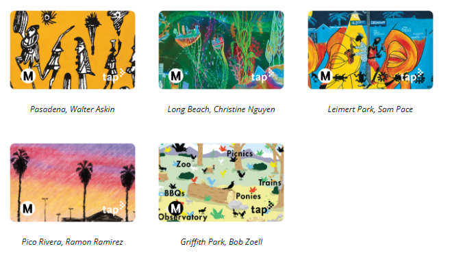
Los Angeles Metro (Metro) is one system where riders get a lot of exposure to it. Metro runs a program called “Metro Art,” which seeks to showcase art at Metro stations and incorporate it into station design, but also houses the “Art on TAP” program. The program, which first launched in 2019, showcases the work of local artists on limited edition Transit Access Pass (TAP) cards that are dispensed at fare vending stations across the city. The most recent Art on TAP cards featured work that was part of Metro Art’s “Through the Eyes of Artists” exhibition, a series of posters featuring art that were inspired by neighborhoods accessible via the Metro. On a brief trip to Los Angeles a few years back, my friend and I hopped around the city via public transit, which connected us to different neighborhoods, sceneries, and art museums like The Getty and The Broad. Not only do the TAP cards add a vibrant, pocket-sized piece of art to the wallets of riders across the system, but they serve as a constant reminder that sometimes, new, exciting corners of our cities and regions are only a transit ride away!
Accessible Art in San Francisco
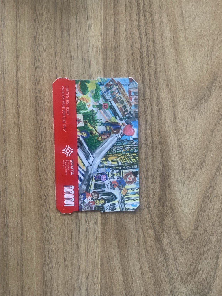
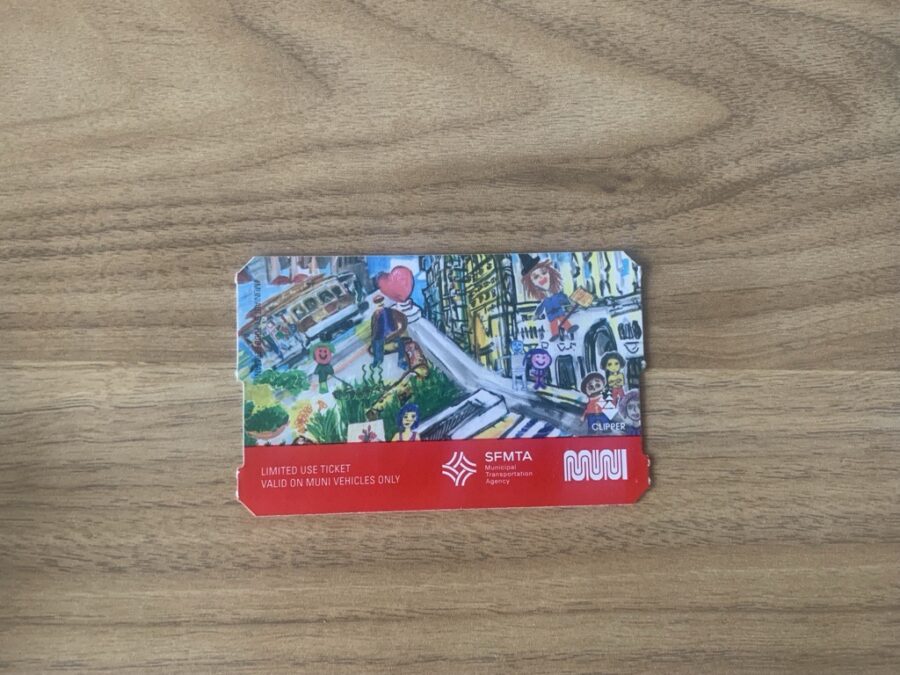
Another agency which has featured the work of local artists on fare tickets is Muni in San Francisco. They partner with a local nonprofit—San Francisco Beautiful—to run its Muni Art program, an annual call for artists that began in 2015. As a way of extending the visibility of the artwork beyond the three-month advertising window set by the program, the agency began featuring artwork from Muni Art winners on fare media after rolling out their new on-board fare machines in 2018. While I’m sure the popularity and increased use of or Clipper Cards (smart fare cards) in recent years has slowed down the need for the agency to produce a new round of ticket production—including those with art—I was able to snatch a Muni Art card in a 2019 visit.
Besides the potential of adding cool additions to my growing collection of fare cards, there are other good reasons to incorporate art into fare cards. It gives opportunities for local artists to get exposure on a wide scale and it gets people excited for something transit related. Residents are increasingly embracing the addition of art in untraditional places, such as on the sides of bus shelters and incorporated into pedestrian safety infrastructure on our roads. Perhaps most importantly, putting art on transit cards increases accessibility and exposure to the arts, especially for populations that don’t have as much access to the arts. For me, getting to engage with art was essential in developing my own self-identity, bridging together my other interests in history and politics, and grounding me in where I lived. But much of my access to art was through museums accessible via transit, something not always available to all transit riders.
Commemorative Art
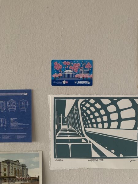
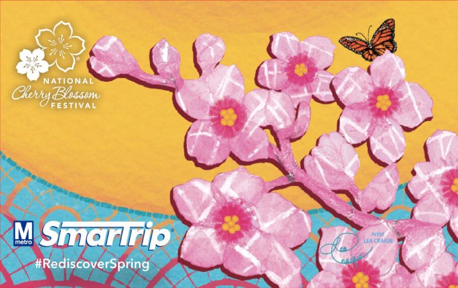
Though not all agencies feature local art on fare mediums, many create commemorative and specialty cards to celebrate certain occasions or events. Besides art, LA Metro also frequently creates commemorative and collector TAP cards for holidays, special events, and marketing campaigns. Metro even released five limited-edition TAP card designs to commemorate the launch of the digital TAP app in 2021. Right here in DC, WMATA has also created many limited-edition cards to commemorate various events, with their most regular being annual National Cherry Blossom Festival commemorative cards. Transit agencies from Rochester to Toronto have released cards for events celebrating transit to those celebrating comic book conventions.
Even if regular art collaborations are far off for most transit agencies, the regular design on fare cards we use every day are also seen as art in themselves, eventually becoming associated to the cities and regions they represent. Looking online for examples of art on fare cards produced many results of people who have both used fare cards as their own canvas to create art to display on gallery walls and those who have compiled their own everyday fare cards to display in their homes.
Though I don’t always see art pieces during transit trips, I still try to look closer into the design decisions made in things like network maps and wayfinding signs. Transit and design are deeply linked, which is one reason Foursquare ITP has an entire group devoted to design and visualization.
That also may be why my first exposure to the field of urban planning came from a data visualization course in college. And even in a world where physical fare media is being phased out, I’ll always be drawn to seeing the various designs of fare cards in the physical form and remain committed to seeking it out, one city visit at a time.
