The “Aha!” Moment
Like most infrastructure, transit projects get complicated. LRT or BRT? Fixed route or microtransit? Above or below grade? Nearside or farside? If these words confuse you, you’re not alone—they trip up transit planners too! As projects become more complex, words alone often fall short in communicating transit goals and potential. That’s where Foursquare ITP’s Design and Visualization (DAV) Team steps in. We bring transit projects to life through a combination of infographics, spatial illustrations, and stylized maps to make visualizing complex ideas easier.
Together, these visual techniques clarify concepts and create an “aha!” moment in our transit projects. This sought-after moment occurs when everything clicks in the mind of a potential transit advocate. We’re particularly enthusiastic about sharing this moment with the public—the people who use transit—to explain how transit works and build enthusiasm for future transit projects.
Infographics
Infographics play a crucial role in transit communications by simplifying complex data and making it accessible to diverse audiences, including non-English speakers and individuals with varying literacy levels. They also serve as valuable tools for public engagement, presenting complicated data, plans, and projections to the public in a digestible format. This provides transparency and encourages feedback from the community.
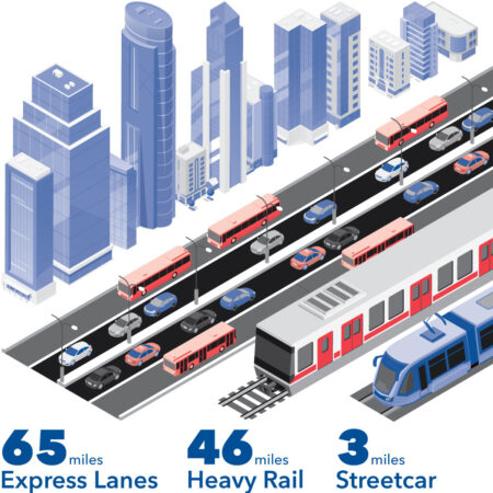
mileage in Atlanta, Georgia.
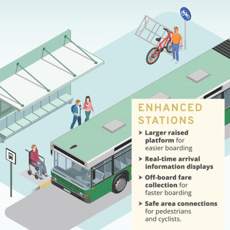
improvements in Bloomington, Indiana.
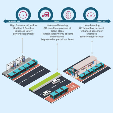
operational differences between different bus
priority investments.
The DAV Team uses infographics to visualize data such as traffic patterns, ridership statistics, and demographics. This approach helps planners and the public better understand trends, optimize transit routes, and make informed decisions about transit infrastructure investments.
Spatial Illustrations
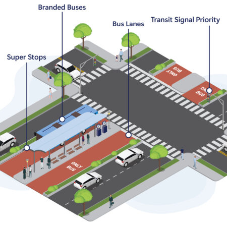
Spatial illustrations help planners communicate how transit and mobility infrastructure might impact—or be impacted by—urban design conditions. For example, installing a bike lane, placing a bus stop, or constructing a dedicated busway would all require changes to streetscapes and traffic patterns. Similarly, planners must consider the existing urban fabric before making decisions about transit service changes or additions. Spatial illustrations are essential for visualizing urban design conditions, like the DAV Team’s examples pictured in this section.
Spatial illustrations can range from simple two-dimensional (2D) representations to more intricate three-dimensional (3D) illustrations. 2D representations are helpful for showing street and sidewalk components and widths, as well as bus stop locations in relation to intersections or other roadway features. In contrast, 3D illustrations demonstrate how various transit, mobility, and urban design features can be integrated into a cohesive design.
Additionally, spatial illustrations are always meant to be schematic and narrative. Rather than acting as technical drawings or complex one-to-one representations, they convey design information in a streamlined way. The goal? To bring that “aha!” moment to as many people as possible, especially local and neighborhood organizations, transit riders, and the public. In doing so, spatial illustrations create a shared understanding and encourage further discussion on how mobility decisions impact physical space, and vice versa.
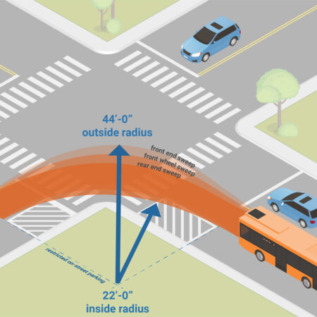
need to clear intersections.
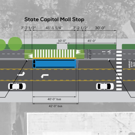
in Little Rock, Arkansas.
Stylized Maps
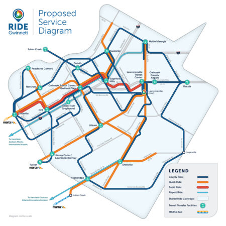
Stylized maps distill the complexities and context of a transit network into simple, easy-to-understand visuals. Network diagrams help users identify what they need to know quickly and efficiently: Where can I go? How often does my train or bus come? What connections can I make? Spatial reorganization and symbol styling choices are used together to reshape the network to be digestible and recognizable, and to add meaning to each element to communicate service qualities.
Developing a grid system and using standard angles can help organize complex networks into a set of easily identifiable routes following predictable shapes. When routes are easier to identify and follow from end to end, transit riders can plan their journeys easily and compare available options and destinations.
In addition to altering the shapes and layout of a network, styling conveys varied service qualities, which can include modes such as rail or bus, frequency of service, or the type of service (e.g., express or local). For example, thicker lines often communicate frequent service levels, while thinner lines show less frequent service. This concept can be paired with color to identify the type of vehicle, such as streetcar or bus. These different styles bring a visual hierarchy to the layout, bringing the most useful options to the foreground.
While individual style choices will vary based on the needs of a network and the audience, the goal is always to elevate the relevant information and prioritize ease of use and understanding. Stylized maps accomplish this by removing less relevant information, so the focus is on where connections are made.
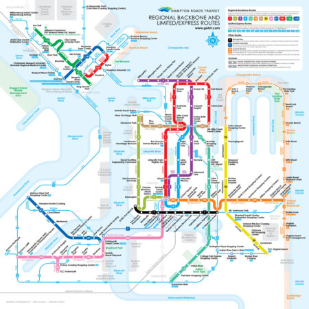
proposed for Hampton Roads, Virginia.
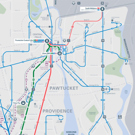
Providence, Rhode Island.
Carrying the “Aha!” Moment Forward
As these examples show, even the most complicated transit projects are easier to understand after Foursquare ITP’s DAV Team has worked on them! Infographics, spatial illustrations, and stylized maps all work together to clarify intricacies and bring that “aha!” moment to the forefront. Most importantly, we firmly believe that the best advocates for transit are those who also believe that pictures are worth more than a thousand words. By carrying the advocacy for transit service into new and innovative projects, we can continue improving accessibility and mobility for all.